
Angular Materialとは
Angular Materialとは、Googleが提唱しているマテリアルデザインというものを、Angularで使えるようにした、UI部品です。
環境
以下の環境で、インストール・環境構築をしていきます。
- Angular18
- angular/material@18.2.2
環境構築
インストール
まずは、以下のコマンドでangular materialのパッケージをインストールします。
ng add @angular/materialインストールを実行すると、以下のようなメッセージが出てきて、テーマなどを選択できます。
タイポグラフィは、テキストを表示したときに読みやすくするために文字を配置する方法で、それをグローバルに設定するかどうかを聞かれます。
The package @angular/material@18.2.2 will be installed and executed.
Would you like to proceed? (Y/n):y // このバージョンでよいかの確認

// テーマを選択
? Choose a prebuilt theme name, or "custom" for a custom theme: (Use arrow keys)
❯ Azure/Blue         [Preview: https://material.angular.io?theme=azure-blue]
  Rose/Red           [Preview: https://material.angular.io?theme=rose-red]
  Magenta/Violet     [Preview: https://material.angular.io?theme=magenta-violet]
  Cyan/Orange        [Preview: https://material.angular.io?theme=cyan-orange]
  Custom

// タイポグラフィを使うか
Set up global Angular Material typography styles? (y/N):y

// アニメーションモジュールを入れるか
? Include the Angular animations module? (Use arrow keys)
❯ Include and enable animations
  Include, but disable animations
  Do not include
とりあえずは、上記の作業でパッケージがインストールされ、AngularMaterialが使えるようになります。
インストール時に更新・追加されるファイル
インストール時に自動で更新・追加されるファイルは以下のようなものになります。
| ファイル | 更新・追加内容 |
|---|---|
| style.scss | グローバルに設定するスタイルの追加 |
| app.config.ts | アニメーションモジュールのプロバイダー設定 |
| index.html | ・iconやフォントなどの参照 ・タイポグラフィの全体適用 |
| angular.json | 指定したテーマのcss参照先設定 |
Angular Materialのボタンを使ってみる
Angular Materialの部品を使うには、まずはモジュールをインポートします。
ボタンを使うにはMatButtonModuleを、インポートします。
import { MatButtonModule } from '@angular/material/button';

@Component({
 ~~
  imports: [MatButtonModule]
})
export class AppComponent {
テンプレート側でディレクティブを使って、materialデザインを使うことができます。
<button mat-raised-button>ボタン</button>
<button mat-raised-button disabled>非活性ボタン</button>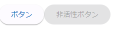
どのようなディレクティブがあるかなどの細かい機能は、公式ドキュメントから確認できます。