BreakpointObserver の概要
BreakpointObserver は、npmパッケージの@angular/cdkに含まれている機能で、画面サイズの変化を検出してレスポンシブなデザインや挙動を実装したいときに使う便利なサービスです。
使用方法
インストール
以下のコマンドでインストールします。
Angularのバージョンによっては、以下のパッケージをインストールする際に、バージョンの指定が必要です。
npm install @angular/cdkコンポーネントの実装
以下のように実装できます。
import { Component } from '@angular/core';
import { BreakpointObserver, Breakpoints } from '@angular/cdk/layout';

@Component({
  selector: 'app-root',
  templateUrl: './app.component.html',
  styleUrl: './app.component.css'
})
export class AppComponent {
  isHandset = false;

  constructor(private breakpointObserver: BreakpointObserver) {
    this.breakpointObserver.observe([Breakpoints.Handset])
      .subscribe(result => {
        // スマホサイズの場合、result.matchesがtrue
        this.isHandset = result.matches;
      });
  }
}
- isHandsetフィールドに、スマホ版かそうでないかをboolean値で値を持たせます。
- Breakpoints.Handsetを引数に渡すことで、マッチ条件をHandset(スマホサイズ)に設定できます
- subscribe内で、画面の変化を検知したら、result.matchesに、マッチ条件にマッチしてるかのboolean値を返却するので、その値を保持します。
テンプレート側
isHandsetに、画面サイズの状態を持っているので、それを使って条件分岐させて、
テンプレートのデザインを切り替えたり、typescript側の処理を切り替えたりすることで、
レスポンシブな挙動を実現できます。
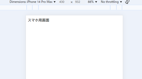
<div *ngIf="isHandset">
スマホ用画面
</div>
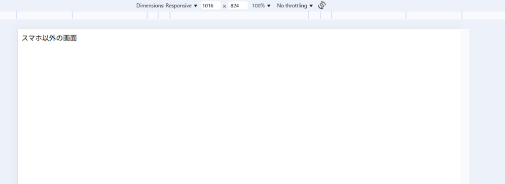
<div *ngIf="!isHandset">
スマホ以外の画面
</div>
実行結果
開発者ツールで、画面幅を切り替えると以下のように、レスポンシブデザインになっていることがわかります。
補足
Breakpointの種類
Breakpointの種類は、以下のようなものがあります
| 定数名 | 内容 |
|---|---|
Breakpoints.XSmall | max-width: 599.99px |
Breakpoints.Small | 600px to 959.99px |
Breakpoints.Medium | 960px to 1279.99px |
Breakpoints.Large | 1280px to 1919.99px |
Breakpoints.XLarge | 1920px以上 |
Breakpoints.Handset | モバイル端末サイズ (portrait/landscape両方) |
Breakpoints.Tablet | タブレット端末サイズ |
Breakpoints.Web | Web/PCサイズ |
Breakpoints.HandsetPortrait | モバイル(縦) |
Breakpoints.HandsetLandscape | モバイル(横) |
複数のブレークポイントを同時に監視
以下のように、複数のブレークポイントを同時に監視することも可能です。
    this.breakpointObserver.observe([
      Breakpoints.XSmall,
      Breakpoints.Small
    ]).subscribe(result => {
      if (result.breakpoints[Breakpoints.XSmall]) {
        console.log('XSmall レイアウト');
      } else if (result.breakpoints[Breakpoints.Small]) {
        console.log('Small レイアウト');
      }
    });
カスタムメディアクエリ
以下のように、定数で用意されてないサイズについては、カスタムメディアクエリで設定することもできます。
this.breakpointObserver.observe('(max-width: 768px)')
  .subscribe(result => {
    if (result.matches) {
      console.log('768px以下の画面です');
    }
  });
まとめ
このように、BreakpointObserverは、レスポンシブデザインやレスポンシブな挙動を行うことができます。
また、画面サイズの状態を保管して、その値で条件分岐しているだけなので、条件分岐で簡単にスマホとPCの処理を分けることができます。
レスポンシブデザインは、メディアクエリやBootstrapなどを使うのが有名ですが、このBreakpointObserverは、TypeScript側の挙動も変えられることが強みです。